
Until it came under criticism from Dr. Williams, the NRMP unwittingly provided in its program materials an example that very nicely demonstrates how using a hospital-proposing matching algorithm disadvantages students.
The example here is from the 1979 NIRMP Directory. It includes four hospitals (named COTH, MASH, PCBH, and TISH) and eight applicants (Alpha, Bravo, Charlie, Delta, Echo, Foxtrot, Golf, and Hotel).
The applicants have the following preferences among hospitals…

…and the hospitals have the following preferences among the applicants.
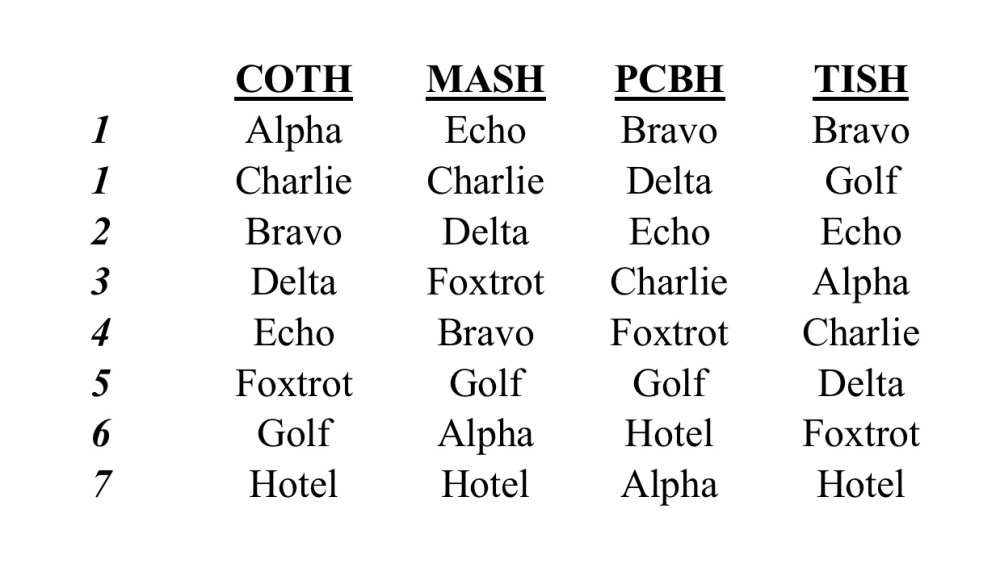
(Each hospital offers two positions in the match – which is why there are two number one ranks on each hospital’s rank order list.)
Outcome when hospitals propose

If we allow hospitals to propose, we get the program-optimal stable outcome. Bolded blue text indicates a match.
Outcome when applicants propose

In contrast, when applicants propose, we get the student-optimal stable outcome. Here, bolded red text indicates a match.
Comparison
Using the NRMP’s own hypothetical example, it’s obvious that who proposes to whom matters. Wanna see? Let’s make a side-by-side comparison of the matches assigned using each algorithm below.
For programs:
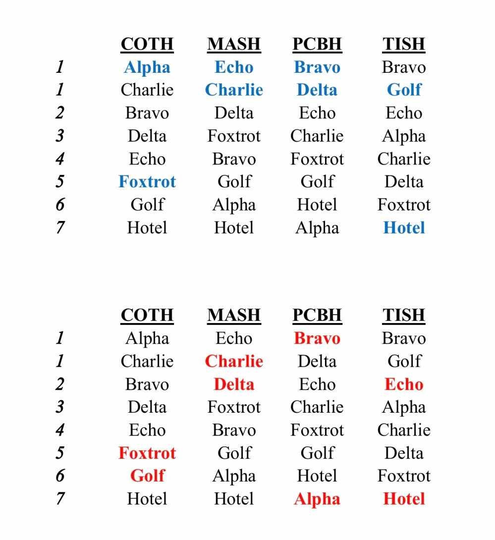
When programs propose (blue), 75% of the matches are at the hospital’s #1 position. When students propose (red), only 25% of the matches are the hospital’s top choice.
For students:

When programs propose, only 25% of students get their top choice… while 25% match at their least preferred program. But when the student-optimal algorithm is used, all of the students match at their #1 or #2 program.
Back
